Wednesday, January 29, 2014

Character-instincts

Obviously the human body has an anatomy, even computers and even letters. Although not as complicated as the first two examples I've given but still something that isn't as inviting to memorize, so its better off understanding it instead.


Typographic parts of a glyph: 1) x-height; 2) ascender line; 3) apex; 4) baseline; 5) ascender; 6) crossbar; 7) stem; 8) serif; 9) leg; 10) bowl; 11) counter; 12) collar; 13) loop; 14) ear; 15) tie; 16) horizontal bar; 17) arm; 18) vertical bar; 19) cap height; 20) descender line. source
Since we are currently familiarizing ourselves in Photoshop, we discussed about the character transformation within the text tool, that includes: Size, leading, kerning and tracking.

Size is already self explanatory, and most of us are familiar with it.

Leading is the space between each line in a paragraph.

Tracking is the space size between all characters.

While Kerning is the space size between specific characters.

Also a common misconception about "Fonts", the right term for it is "Typeface", while font is the combination of a typeface and style (e.g. arial bold, times new roman italic).

There are typefaces that doesn't have lower case letters or styles or both, and so there are these buttons within the character transformation menu where you can enable upper/lower case letters, bold/italic, super/subscript, etc.

Here's a sample playing around with the settings


Wednesday, January 22, 2014

That is so Kul

I never noticed the Kuler Extension in Photoshop CS4 until now, or maybe because my version of Adobe Photoshop CS4 doesn't have it yet.

Kuler is a plug-in where you can create your own color schemes. It has a color wheel where there are arrows pointing to what color you want to include in your color swatch, it varies of what type of schemes the arrow will be based on (e.g. monochromatic, complimentary, adjacent, etc).

Our professor also discussed about layer blending modes, there are 6 categories, there's one who makes the darker colors stand out, there's one with the lighter colors, and there's one with both, one that gives a negative effect, and last is the one that focuses on color.

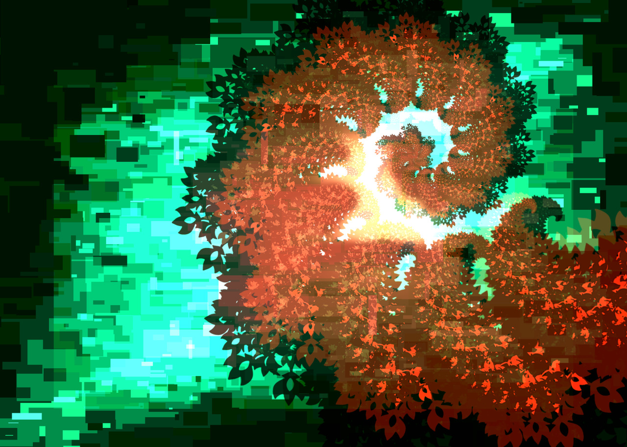
Here's a sample of a piece where I used a color scheme and some blending options (screen, overlay and multiply)


Wednesday, January 8, 2014

2012 vs 2013 Photoshop Works

I don't even think there's an improvement :\

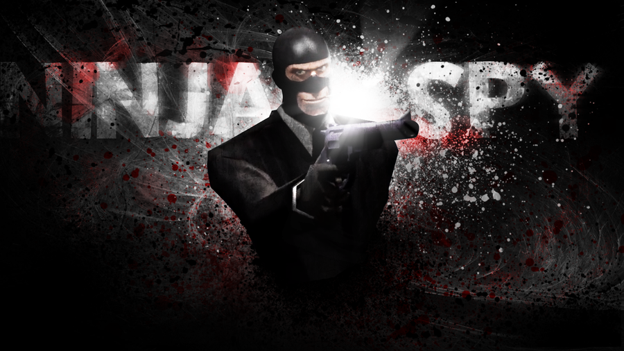
2012
Ninja Spy Wallpaper by Py-Bun

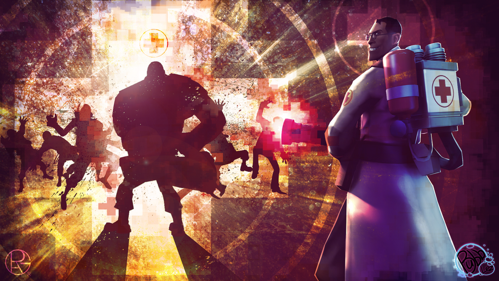
2013 (Collab with Bubblez, he did the Medic/Guy on the right pic)

Pens and Brushes and Pens

Our last lesson in Color Theory sure was interesting. I mean, our professor taught us how to use the pen tool as a path for the text, I never knew that before. Here's a sample

and the other one was putting text in a shape (with a photo screened over the black text), like this:


While the brush settings are already familiar to me, here're some results of those different settings, combined and solo: