Tuesday, December 3, 2013

Calling Card Design Samples

For our Color Theory and Principles of Design Class after discussing about the topic of C.R.A.P.

C.R.A.P. stands for Contrast, Repetition, Aligntment and Proximity


Technicalities in Colors

If someone knows the capabilities and limits, it is easy to understand and will have more ease in making something work or solve a problem.

Just like our eyes and the computer screen, our eyes have the wider range of colors that we see, while the screen has a little less.

There are times that if we print pictures, it won't print exactly the same set of colors as we see it on screen or in reality. Basically Eyes>Screen>Print

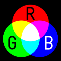
RGB (Red, Green Blue) is for light


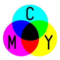
While CMYK (Cyan, Magenta, Yellow, Black) is for print


Color Spaces


There are a set of color spaces that can be based upon, the first one is the Lab Color:
Unlike the RGB and CMYK color models, Lab color is designed to approximate human vision.

ProPhoto RGB

is an output referred RGB color space developed by Kodak. It offers an especially large gamut designed for use with photographic output in mind. The ProPhoto RGB color space encompasses over 90% of possible surface colors in the CIE L*a*b* color space, and 100% of likely occurring real world surface colors making ProPhoto even larger than the Wide Gamut RGB color space. The ProPhoto RGB primaries were also chosen in order to minimize hue rotations associated with non-linear tone scale operations. One of the downsides to this color space is that approximately 13% of the representable colors areimaginary colors that do not exist and are not visible colors.


The Adobe RGB color space is an RGB color space developed by Adobe Systems, Inc. in 1998. It was designed to encompass most of the colors achievable on CMYK color printers, but by using RGB primary colors on a device such as the computer display. The Adobe RGB color space encompasses roughly 50% of the visible colors specified by the Lab color space as well as improves upon the gamut of the sRGB color space, primarily in cyan-greens.


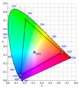
sRGB defines the chromaticities of the red, green, and blue primaries, the colors where one of the three channels is nonzero and the other two are zero. The gamut of chromaticities that can be represented in sRGB is the color triangle defined by these primaries. As with any RGB color space, for non-negative values of R, G, and B it is not possible to represent colors outside this triangle, which is well inside the range of colors visible to a human.

Mostly used in Web Designing.

===========

References:

http://en.wikipedia.org/wiki/Color_space
http://en.wikipedia.org/wiki/SRGB
http://en.wikipedia.org/wiki/ProPhoto_RGB_color_space
http://en.wikipedia.org/wiki/Lab_color_space

Wednesday, November 27, 2013

Rule of the Ratio

Math is everywhere, not just in school or in work, not just in the works of man, but also in God's. These numbers, ratios, proportions and equations can create something pleasing or even perfect. There is a rule, and the famous and widely used one is the "Rule of Thirds", which can also be related to the Golden Ratio and the Fibonacci Sequence.

Rule of Thirds - is a technique in visual composition. It is simply dividing (for example) an image into 9 equal boxes, or a 3x3 grid. To follow this rule, you must put the subject on the parts where the lines of the grid intersect, sometimes not exactly but its more pleasing to see the subject in that position instead of it placed on the edge of the image or plainly in the center, but still, there're standards to not use this rule.

The Rule of Thirds creates a space in the composition which pushes the attention to the subject that is placed on the imaginary intersections.

Below are 3 pairs of images that consists of: First (Original/Uncropped) and Second (Edited/Cropped to follow the R.O.T.)


The Fibonacci Sequence and The Golden Ratio are related because The Golden Ratio explains that equal proportions have a ratio of 1:1.618. For example: the perfect or normal proportion of the hand to the forearm is 1:1.618. Artists in History and today have been using this to create their artworks.

As for the Fibonacci Sequence or Spiral, it has this pattern of numbers such as "1,1,2,3,5,8,13..." the sum of the previous 2 digits makes up the next number, and whenever you divide one number to the previous, it will have a total of 1.618. The larger the numbers divided in the sequence, the nearer it gets to the Golden Ratio.

 An example of the Golden Ratio is applied to the face, there is a diagram called the "Golden Ratio Mask" that determines the perfect face, if someone's face fits in it, it is perfect, while I tried it on mine, its not, although not a big surprise.


Wednesday, November 20, 2013

Filling Up the Spaces

Even though I already know a lot of tricks in photoshop, its still not enough. There are a lot of still things I have to learn other than shortcuts and how to use different tools on my work. 

It's like entering a diner or a restaurant, I'm so eager to eat that I just missed a sign board on the front mentioning customer privileges or a discount on a certain condition whenever I order. And because of that, every time I enter, I'm unaware of the stuff I can lose or gain. And that is what it feels like after today's lesson in Principles of Design and Color Theory.

We discussed about setting up the preferences in Photoshop. (Ctrl+K)
In the General settings:
  • Image Interpolation: Bicubic Best
  • The checklist under the Options are self explanatory, it will depend on the person of what they think is convenient.
  • Enabling History Log encodes the History of events in the PSD file but makes the file size bigger.
  • The Interface settings is associated with the appearance of the UI.

In File Handling:
  • Its recommended that the lower cased file extensions are checked because its widely used, specially in web designing, because it doesn't support upper case letters.
  • Since PS CS4 doesn't have the autosave option, the user better remember to save every 10 minutes.

Under Performance tab:
  • Never go for 100% memory usage because it might crash the background programs, the recommendable is 80%-90%.
  • History States are the number of undos, while the Cache is the temporary level of data that can be preserved. Both of these are not recommended to but in the maximum numbers because it will cause the program to hang or crash.
  • The Scratch Disks are the partitions where you can lean the processing into, if you put the processing on a disk with no more space, photoshop will have a hard time processing your work compared to a disk/s that has a space.
  • GPU settings shows information what your video card is and if its capable of the 3d interface in the software.
Cursor preferences lets you choose what you want your cursor to look like while you work.
Transparency and Gamut is the appearance or color of the pattern of the empty background on a transparent image in photoshop. 
In Units and Rulers, a lot of people and even most printing companies use the English System of Measurement (e.g. inch, feet, yard). 
While the Guides, Grid & Slices deals with the color of what the name says.
  • To enable the Grids by going to the View Menu>Show>Grid. 
  • You can have guides or margins by alt+click+drag from the ruler either from the left side or top. 
  • While the Smart Guides is the line that appears if a certain object in the workspace are in line (e.g. center,top,bottom, side) with another object. It can also be found under View>Show.

Well I think that's all I can remember about what I've learned today. I'll get back to this whenever I need it.


Tuesday, November 12, 2013

Another First Step

There are things that you can just take easily, so easy that you don't need to think for more than five minutes. Things that mildly affects your everyday life such as buying a snack from the cafeteria, or brushing your teeth, such things that are already a daily basis for a person that they got used to doing that they dwell on it very long. But there are chances and opportunities that we have to think thoroughly, and decisions that we have to take that may affect a part or even parts of our lives, and these are the things that you can't just take easily, you have to go through a lot thinking and processing "What could happen if I do this?". You have to carefully inspects the aspects of things to know what to expect and to know what you should do.

Stepping right into this class (Principles of Design and Color Theory) conducted by Mr. Rey Mendoza, is a decision I won't regret as much as the ones I've taken, but was necessary. Either way, its a 4-hour session, starting from lunch, and of course, even for a first day, such amount of time shouldn't go to waste, we started off with introductions, then it eases into the first lesson which was about the first forms of Graphic Design, it didn't take very long maybe because the fact that we also have another major subject that will tackle on that. After that, we proceeded on how to handle a project by discussing about asking the questions like "What is the goal?", "Who is the audience?" and "The Time and budget it takes for the said project". I know that I will enjoy this subject because it will focus on something I'm interested in doing and I'm curious about. Although I don't think I'll be able to handle such clients like the given examples we were given, or at least the part that I have to budget the time and money, or specifically the printing part of the job. I'm more on with digital works, but I'll just think that its for the benefit of my future having to know these things.

Even though I have knowledge of a lot of things by now, it doesn't hurt to learn more as long as I'm willing to.

Sunday, September 22, 2013

Abandoned Heaven


what if whenever someone abandoned a house or a town, the structures will eventually start to rise from the ground and float to the sky and they all gather up and form a big chunk of land

its like a heaven of abandoned human establishments

Friday, September 6, 2013

Catching the Truth in the Sea of Lies, with the help of a Digital Net

The fisherman goes out to sea to catch some fish to be brought home to eat or to sell it on the market. Being an investigative journalist is quite the same in a metaphorical sense. They go out to places, get the news and findings and bringing it on TV for the people to see.

With the technology today, everything is much easier. From taking records of the event to putting it on screen. Documents and other media-visual evidence can be easily destroyed in the old days, but now, with digital methods, someone can have countless copies of these without having to worry that someone will destroy it until it is non-existent. New Media also helps non-journalists to bring information about occurrences in their area, specially when there're no reporters around to witness it, and thus they also contribute to bringing the news to people.